Week 1 - observing closely an object and taking it apart by abstraction, simplification and surrealism
 |
| Apple, oil pastel and charcoal |
 |
| Surreal, education, roots, adam and eve and the world, charcoal and biro |
 |
| Apple, abstract, fabric, old paint gouache layered with knife, watercolour with sponge, kitchen roll and watercolour |
 |
| Organis Forest Form, Simplification, abstract and surreal, felt-tip, ink and watercolour |
 |
| Organis forest form, simplification and abstract, felt-tip, inks and pencil and watercolour |
 |
| baby in cocoon, surreal, ink and felt-tip |
 |
| orchid, watercolour |
 |
| Journeys and maps, Abstract and simplification, bleach, thread, pastel, watercolour crayon |
 |
| Jelly Fish, Surreal, pastel, watercolour crayon, sponge |
 |
| Surreal, leopard print chair |
 |
| Drawing on location at FCH, ink and pencil |
 |
| Abstract and simplification, leopard print chair, oil pastel, graphite |
 |
| line work observational drawing, Bostons T Party, fine liner and ink |
 |
| subjective view points of ellipses with ink and a stick |
 |
| line work observational drawing, Bostons T Party, fine liner |
 |
| line work observational drawing, Bostons T Party, fine liner |
 |
| line work observational drawing, Bostons T Party, fine liner |
 |
| subjective view point of a bicycle and a bucket, charcoal |
Week 3 to Week 4 - investigating 2d perspective and continuing exploring with ink (trying to concentrate on just line no tone and pattern)
 |
| Brown ink line drawing - Europe architecture |
 |
| brown ink - water - line - cheltenham races |
 |
| blue permanent marker - line - cheltenham promenade |
 |
| black ink - wash - line - Cheltenham races |
 |
| section from the telegraph - editorial illustration- looking at sequencing and placing of text |
 |
| Butler Work- reportage illustration-inspiration - line work |
 |
| pencil and ink - Europe architecture Week 5 - turning boxes into buildings and cars into characters pencil, oil crayon,felt tip, fine liner     Week 6 - We went to Cheltenham pump rooms and did observational drawing there. Back at the studio we had to try and remember visually what the building looked like and what aspects we liked about the building and create an illustration. I found the curves and layers interesting therefore i had a go at reinventing the pump rooms with these aspects. 
Week 7 - 3D lettering and perspective and starting to look at colour use

Week 8 - Investigating colour and pattern - pop art bag, using feltip and watercolour - discovered light and shadow effect the pattern and colour
 Week 9 - taking three of the colours from pop art bag and using there complimentary colours as well from observational drawings from our journeys project (st pauls to montpelliar) - i found shop fronts and social class and peoples behaviour as you changed areas most interesting and wanted to expand on this idea so experimented with watercolour and pastel and format.  Week 10 - the Journeys plan - looking at mustafa soydans work and the way he connects objects with women's hair and uses the women's face as the main feature in his work, i want to do this with half a posh ladies face (representing montpelliar) and the other half the face being a tramp (representing st pauls). i will use the hair of the lady and the beard of the tramp to connect maps showing the different sides of the page and therefore going off into a mind map of the contrast of peoples behaviour in the different areas of cheltenham, the social class and the contrast of the outside of buildings and their appearance. There will be sunglasses reflecting a small narrative of a posh lady and a typical scene that i found in st pauls in another of the sunglass windows - again to show the social contrast. black and red will be used so specific illustrations will be highlighted in red to guide the eye of the reader around the page. http://www.mustafasoydan.com              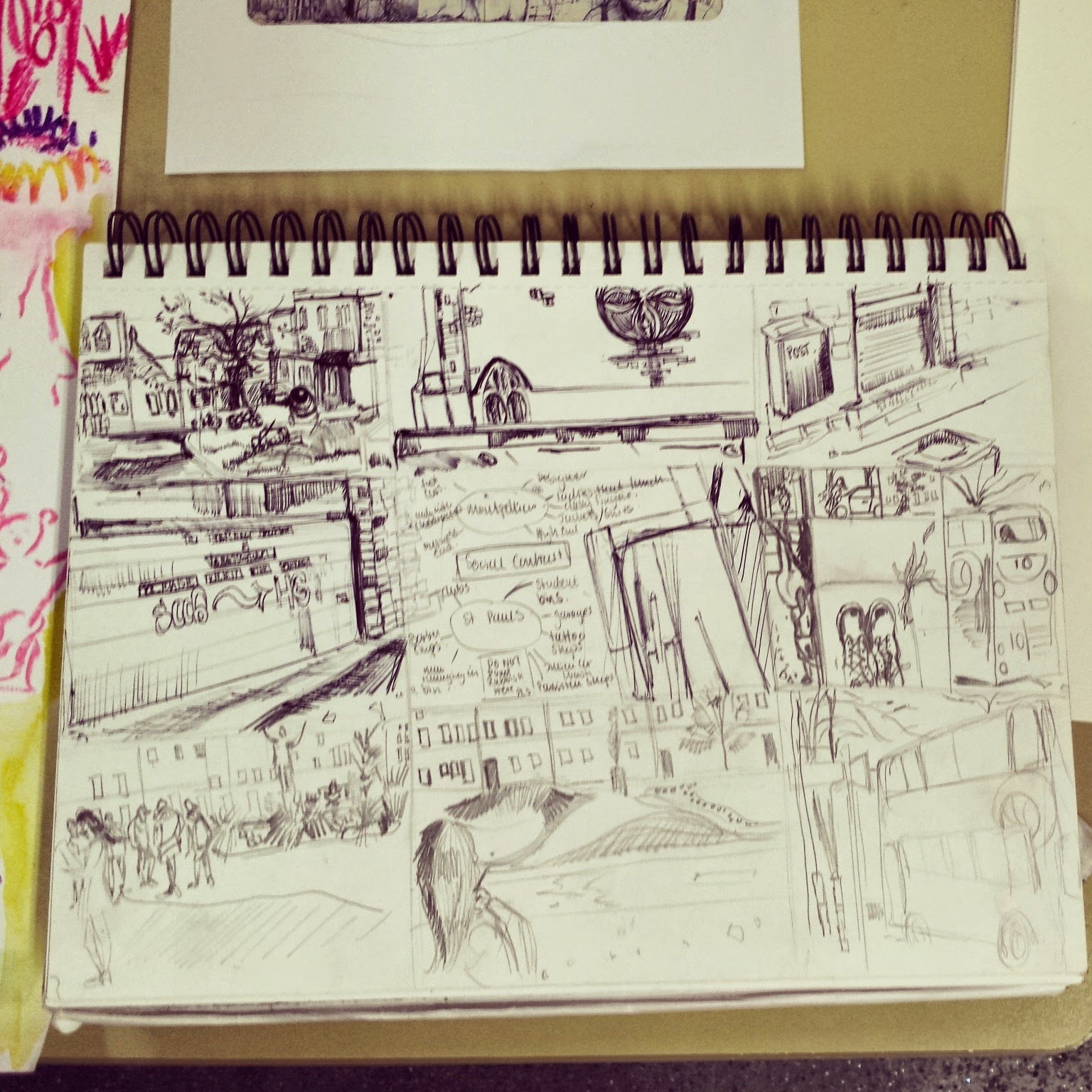  Week 11- 12 - interior and exterior surroundings and how to use dramatic light - over overexaggerated with ink and biro and watercolour - observational drawings from the studio to the fch cafe - took a sketch i did of the fch library (that looks like a castle) that inspired my children's book idea about a girls lost heart trapped in a castle where owls watch over it - it was great to experiment with taking the reader eye through some of the exterior parts of the castle and then adding narrative.     Week 13 - 5th January 2015 - we did life did life drawing and intensely observed proportions in different media and apparatus - ink and stick - red chalk - watercolour and paint brush. I need to improve on quick planning and measuring accurately of the whole figure not just one part of it as i go along, hopefully this will improve after the next life drawing session next week.   
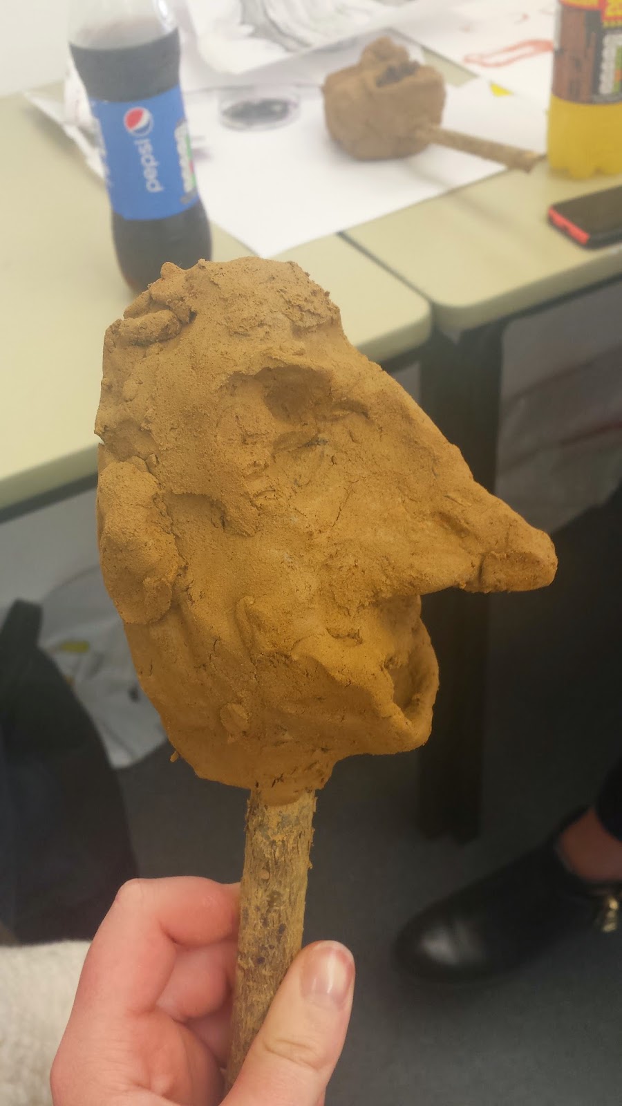
Week 14 - Clay heads - analysing Nigel Ferage (the politician for the UKIP party) and how he conveys himself. Our intent was to investigate the idea of communication something about the nature of someone by exaggeration/caricature. we had to communicate a personal perspective of his politics and opinions. Therefore i researched some quotes that Ferrage has said and watched a few youtube videos to get his general personality " i wouldn't be a good priminister" "immigration isn't all bad because foreigners have helped improve Britain's awful food." "I'm like marmite, some people love it" from this i have an opinion that Ferrgae is quite up himself and cocky therefore looking at his body language and features to represent these traits, i have extended his nose, flattened his face, thinned his turtle neck and made his eyes more inward. Inspiration has come from caricaturist Honore Daumier who in the 1840s published caricatures depicting me members of the legal profession and created sculptures of the french members of parliament. (exaggerating features on the clay models to convey his own opinions of them).
Week 15 - Our intent was to do visual notes of a journey to create a short story board to illustrate events, situations, characters to communicate feelings, thoughts, time and situation. Therefore i have done a day out with a fat farmer called firthy in the cotwolds, illustration characters and animals that i saw and surroundings in ink and pencil and charcoal. each media gave a different feeling to the sketch. i feel majority of these sketches are quite gestural and loose to show characterisation and movement.
      
Week 16 - Gesture - observing movement and using a loosened hand to my drawings to get a rapid over view of perspective and position to emphasise gesture. After outlining this i would add shadow to enhance the atmosphere. Too improve on getting gesture correct i need to do more observational drawing using the skills i learnt in the lesson. (sometimes its more about getting the essence or direction than exact accuracy in some cases) i used charcoal, biro or sanguine - light flexible material to get fluid marks.
Week 17 - Monocular -Telescope - "The elegant march of the hare" today we made a paper telescope and observed objects and elements in a particular surrounding. I drew elements from my cottage in the countryside (inside and outdoors) to create a narrative in an illustration about where i live in the cotswolds (severnhampton). Focusing on pattern, shape, wildlife and fashion. looking at each element and commenting on how they made me feel or what they do or can do as an object i linked things with other elements i have drawn. e.g. the house i saw in my village i drew its window and patterned bricks, that i find fascinating, and put the elements in the platformed shoe to create an "old mother huboard scenario". Being inspired by trees that are constantly surrounding me i wasted to show organic growth and use the composition like a structure of a tree branching into various elements and thoughts. I used brown and ink and pencil and a bit of collage to investigate depth and texture. From the help of early thumbnails i think my composition has gone very well, due to me sometimes overdoing line and cluttering too many objects together. (inspiration Gabriel Moreno - simplifies imagery and Sergio Membrillas - elements interacting with structure of tree)
      
"the elegant march of the hare"
Week 18 - Monocular vision - chapel - i analysed different viewpoints of an object that was one of the "chandelier" lights in the chapel. looking at this object and the way light changes and effects its shape as you change viewpoints, i was intrigued by the other lights that hung off the main core light that reminded me of chandeliers and mind maps structures. Therefore as i am investigating into reportage illustration i looked at George Butler's work and how he makes you sense the character, scenarios, wilderness and wildlife from using blocks of colour, shapes and sometimes leaving a couple of elements detailed so the eye has room to rest and concentrate. Therefore i focused on the banning of fox hunting (potential idea for FMP) and took inspiration from an article from the guardian (http://www.theguardian.com/uk-news/2014/nov/22/foxhunting-ban-10-years-on-countryside-changed-for-ever) and from various quotes i read i was inspired to illustrate the atmosphere and characters in a "molecular"/ George Butler style. From my observational drawings of the chandelier light i used the structure and put the core in the middle that is a fox and added elements of a chandelier light that made the eye flow into other traditonal narratives and scenarios of fox hunting. Questioning is the social aspect of fox hunting and how its changed from the past?
Quotes that inspired me from the article - " farmers has a vested interest in killing foxes, which preyed on their livestock; a hobby rider out for an enjoyable days riding in autumn sunshine doesn't really care what is being pursued, a fox on a scented rag"
- " The people that hunt now are different, it used to be famers, sons and daughters there aren't now. The farms are bigger and mechanically minded, they sit on tractors not horses."
    
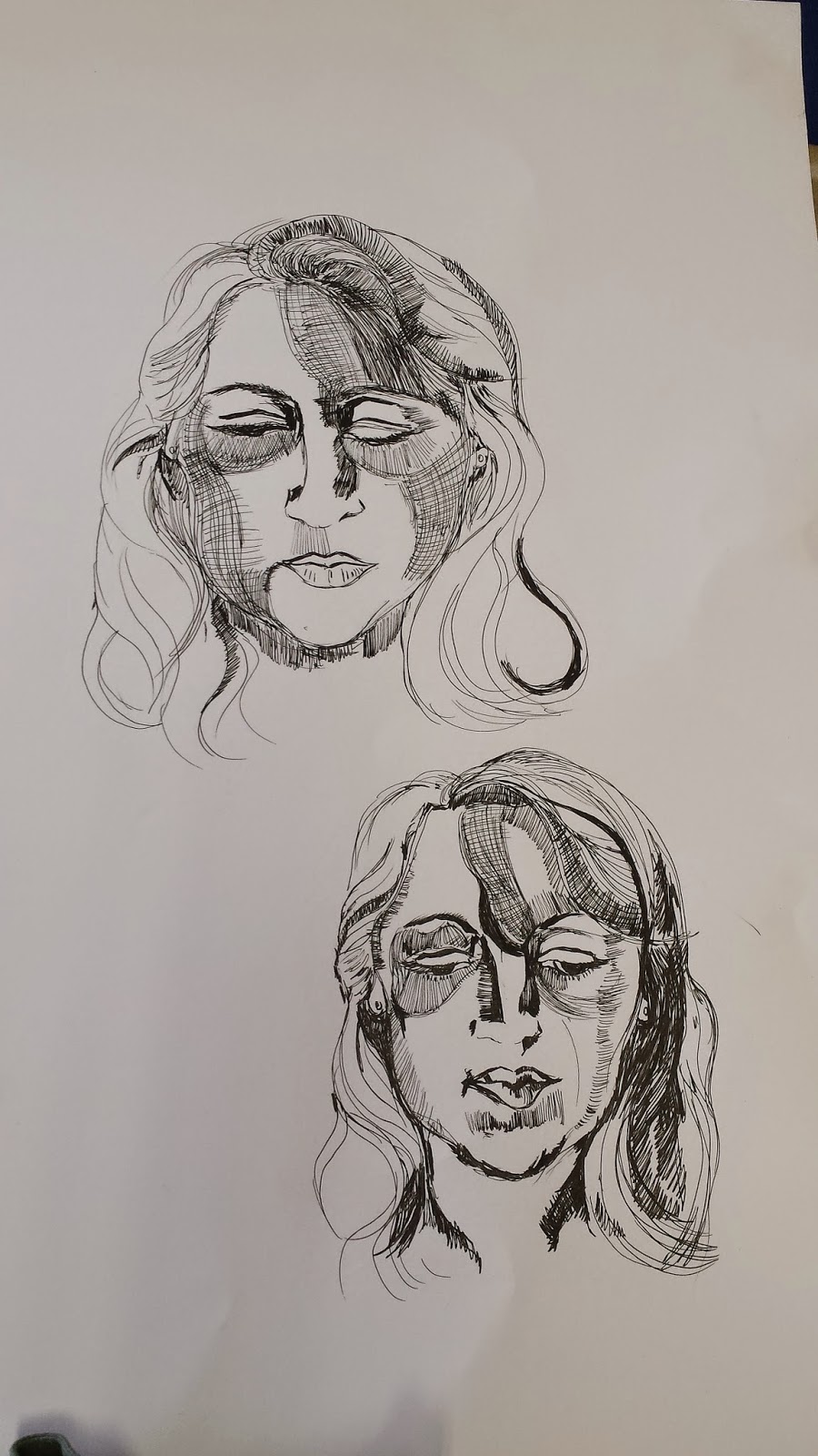
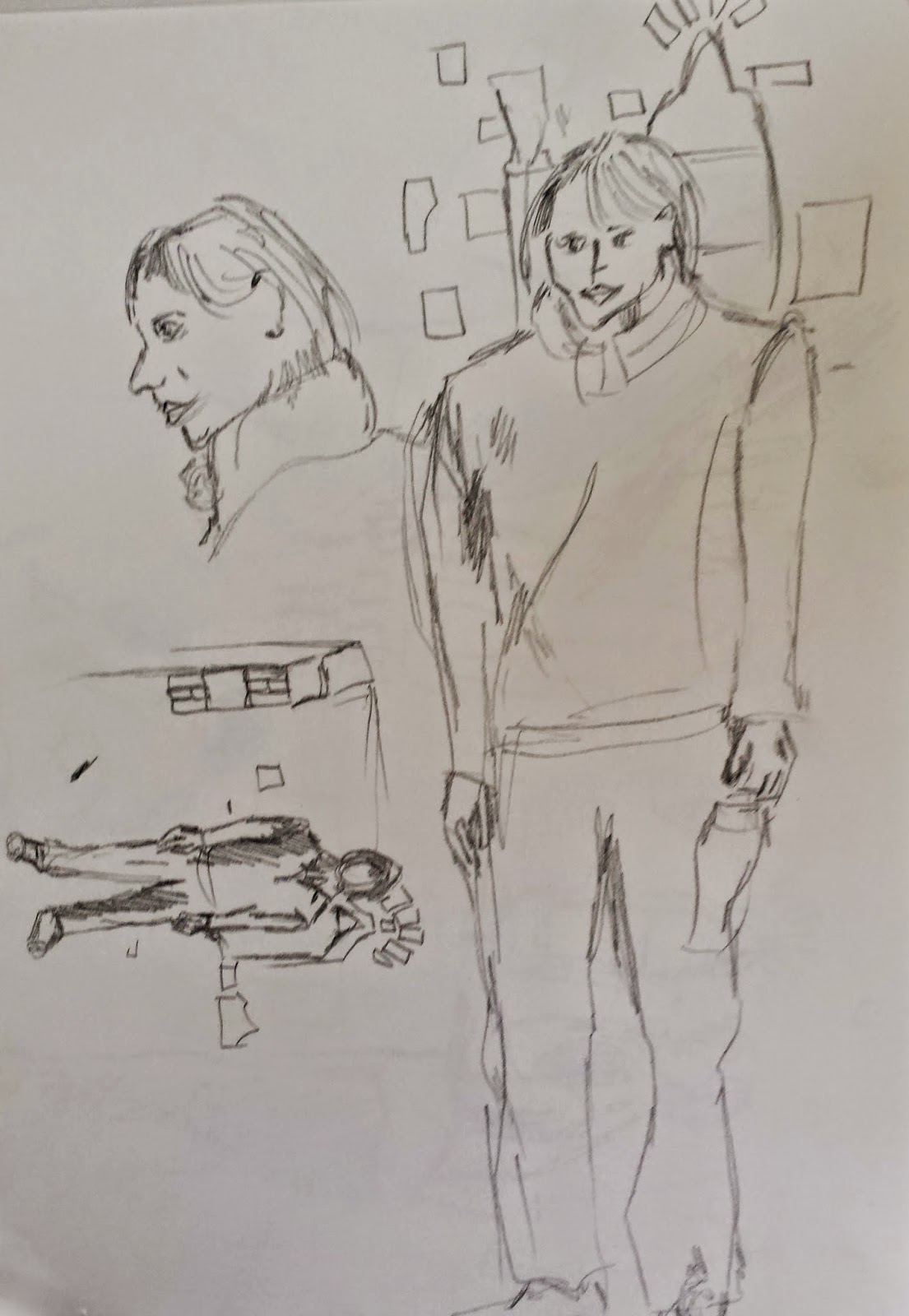
Week 19 - 12th March 2014 - observing different gestures demonstrated on a 1950s black and white film, based in vienna after the war about a man running away (see below to read synopsis). whilst watching the film i found tension and the vanishing points most interesting to my eye and silhouettes to create a dark mysterious atmosphere. The feelings i received during this film is tension, fear, despair. Therefore i want to convey this with various gestures and posture that we analysed with a life model to convey these feelings. i have been drawn to shadows and silhouettes to create a dark tense atmosphere, especially looking at Brecht Evans work that deals with pattern,shadow,transparency,movement,silhouettes and colour to create a mysterious atmosphere. (look below for pictures)
After drawing sophie's poses and gestures inside and outside (interesting to see with different context, especially figure behind walls and stairs , just like in the film, helped give more of a narrative) therefore from looking at direction of light and mastering the organic swoops of mark making to create gesture. Our task was to create a narrative conveying the feeling your felt during the film with the poses from life drawing.
what i learnt during this lesson - hold pen or pencil at the top to create free flowing marks, need to work on create marks or shadow that shows weight distribution - i enjoyed using the permanent marker for a different media because it made me draw strokes instead of repeated bitty lines.
Brecht evans influence
 
here is the start of my narrative (draft) - i have tried to incorporate the emotions i have had from the film (anxiety, disappoint, fear and mystery) by using and over exaggerating the figure and gesture that conveys the emotions with colour,shadow and silhouettes and most of all transparency.

Week 20 and onwards! - we have explored a number of life drawing poses with Sophie after watching a mummy film and a comedy of two people trying to balance on scaffolding "laurel and hardy in liberty 1929" -all of these types of media have the same emotion tension, fear, despair, adrenalin and anxiety. Therefore i have taken these poses and have created two characters that are based from where i live in the countryside (cotswolds) called foxy lady and bunny. These two characters create mischief around the cotswolds. From drawing these poses that convey these specific emotions and images from the countryside scene i have started to generate a narrative. "foxy lady fighting bunny for the dapper country gentleman" and "foxy lady creating mischief in the cotswolds". I feel i have conveyed these emotions from the media we have watched with movement, surrealism and colour. I have used bold colour pallets to practice with because from the children's project i have learnt that a 2-3 colour pallet suits my heavy pattered style of illustration and most importantly leaving white areas for the eye to rest!
            |
No comments:
Post a Comment